Amazon
fine art identity
-
Amazon Fine Art was a full identity exploration for a curated art marketplace inside Amazon.
The goal was to create a visual system that treated artwork with the same respect as a physical gallery—balancing editorial clarity, scalability, and commercial usability. The work explored multiple visual directions, testing how typography, image treatment, and layout could elevate art without overpowering it, while remaining flexible enough to support a large, evolving catalog. -
I led the visual identity and concept development from end to end—defining typography, color usage, image treatment, and layout behavior across multiple directions. I explored and presented distinct creative approaches, evaluated their performance against usability and brand goals, and refined the strongest system into a scalable foundation suitable for a high-traffic retail environment.
final system
Identity system that respected art, survived scale, and outlived the page it was built on.
Concept Exploration
“Opacity”
Opacity explored a pop-art–influenced approach, using bold color fields and layered transparency to mirror the intersection of art and commerce. This direction intentionally embraced visibility and impact—borrowing from Warhol-era repetition and contemporary poster design to make fine art feel immediately accessible to a broad audience.
While visually compelling, this direction risked competing with the artwork itself—introducing a strong brand voice where restraint was ultimately more appropriate.
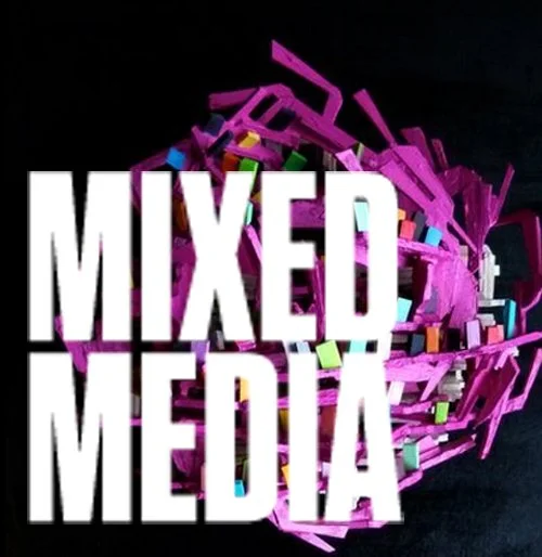
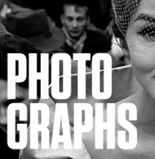
“Block”
Block explored typographic dominance as a way to establish authority, using bold, oversized type to create a strong category voice within Amazon’s interface. In select placements, artwork was intentionally clipped into letterforms—blurring the boundary between content and identity and positioning Fine Art as a confident, editorial-led destination.
While the Block direction established a strong, ownable presence, it risked shifting focus away from the artwork itself—introducing a brand-forward voice that could compete with the art rather than support it.
“Outline”
Outline ultimately proved to be the strongest solution, drawing inspiration from museum placards and archival presentation. By using framing devices, strict typographic hierarchy, and minimal color, the system clearly separated artwork from interface—signaling curation, authenticity, and respect for the art.
This approach allowed Amazon to act as a host rather than a narrator—creating space for the artwork to lead while establishing a consistent, scalable category identity.
Option A
Option B